
Paula Scher's maps are often massive in scale and very colourful, she has mapped Paris, India, China, South America as well as USA and some states individually. Paula's maps are striking and grab your attention immediately, she uses pattern and texture to create her pieces as well as text which makes the maps seem intense and chaotic but I think adds a layered structure.
Her maps are political, this can be seen as she names the places she maps as well sometimes adding her own perspectative to them, which is where the colour of each piece comes from, her own view on that place is reflected in the vibrancy or darkness of the colour.

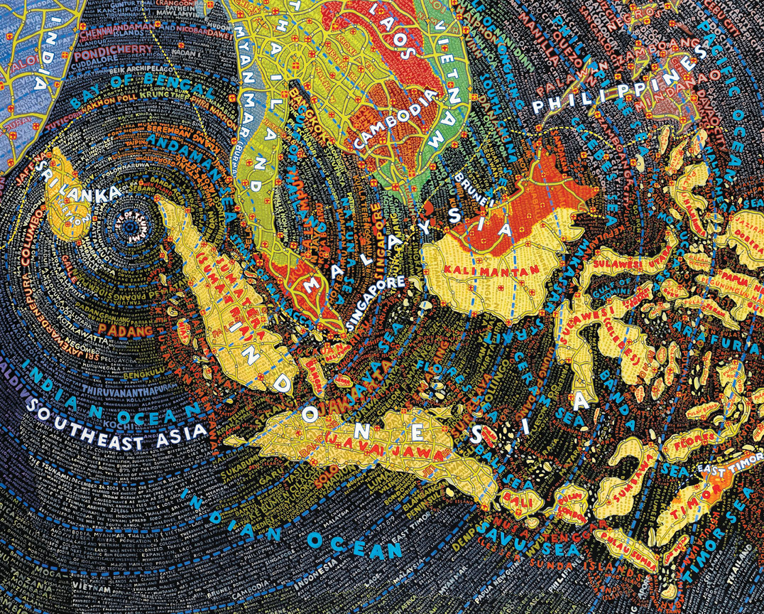
The map on the left is China, it has been depicted as soft, natural, welcoming colours, alot of light purple used, also Paula uses round edges alot, hardly ever uses sharp lines, I think she does this to add a bubbly lighter tone to whatever map she is doing. The map on the right is of the Tsunami and areas affected, in this map the colours are noticeable different very strong bold, moody colours have been used here to reflect a more emotional response. Paula also uses the text to create the idea of Tsunami in this map by having the words radiate through out the piece.
No comments:
Post a Comment